19
2013
Shutter Speed Assignment Images
This is just a friendly reminder to critique each others’ images in the Flickr group. If you’re posting there, take the time to critique at least one image per class member Our class is small so the time commitment there is maybe 10-15 minutes. But more importantly, when your’e critiquing other images you’re learning to articulate what you do and do not like about images; this makes you a better photographer. And by critique I don’t mean “Great job!” Really work a bit to use the Oreo Method we talked about in our first assignment. Tell them why it caught your eye, one area you would do differently/could use improvement, and one thing they really rocked at. It’s just three sentences 🙂
And if you’re new to the class, please jump in on the current lesson and work backwards if you want. There’s no grading and no roll call, do what you can with each week’s assignments 🙂
Those things said, here’s a sampling of what class members produced this week!
1. Freeze the Action (Fast Shutter Speed)
Amanda froze the action of this mother/son duo with this beautiful sunlight streaming down. I think jumping was such a fun idea for this age that sort of fears the crazy lady with the camera. I also love the lighting here!
2. Don’t Freeze the Action (Slow Shutter Speed)
Jessica got her camera as a Valentine’s present! How sweet! So at the time of this image she’d barely held it for three days. I’m so glad she has the courage to jump in on this (Actually, I’m still humbled that I have a ‘class’ at all!). This is an image of her daughter being pulled in a makeshift sled. The captured motion makes me feel the shrieks of joy.
One word: Dreamy. I’m so glad you went for the ultra slow shutter speed, TeddyBouch! It’s a great exposure and I always adore images of the red tail lights where you can’t see the car. There’s just this lonesome feeling about how fast time really does pass right before our eyes.
3. Give Panning a Try (Slow Shutter Speed)

I love this panning shot by CraftLea. I love the colors, the fabulous blur on the couch, the tack sharp hair, the giggles she must have been hearing. But mostly I like how this is such a metaphor for mothering: how we can freeze just a momentary memory, but all the moments just keep on going as the kids keep growing.
Andrew isn’t entirely new to the idea of panning. He does the camera motion all the time only with a very fast shutter speed to freeze the action. His favorite subjects (birds) lend themselves well to this technique with a slower shutter speed, don’t you think?

I may or may not end up being at fault for TeddyBouch getting a distracted driving ticket. Ahem. Very creative use of the panning technique!
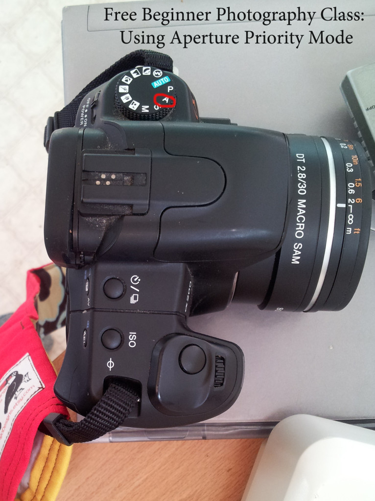
Aperture: What is it?
When we looked at how cameras work, we defined aperture as “the hole that lets in light,” and really that’s what it is. Aperture is an opening (usually where the lens joins the camera body) that controls the amount of light that enters the camera.
Aperture is deceptively simple, but understanding how aperture affects your final image is pretty difficult because of the ridiculous amount of vocabulary connected to it! In fact, the sheer amount of vocabulary is going to tempt you all to skip reading this, but don’t give into temptation! If you do, you’ll have no idea how to complete the assignment!
Read More»12
2013Okay so we’ve tackled one of two harder points of the exposure triangle, now let’s hit the easiest: shutter speed. I promise this concept is so much easier to understand than ISO. Plus you won’t have to deal with any crazy family skin tone metaphors. Ahem. But first lets have a look at some of the results from our Camera ISO assignment!
Camera ISO Assignment Recap
Not many of the participants were able to get their images in the Flickr pool in this one week assignment period. If you didn’t get your assignment in “on time” (or are joining the class late), feel free to add it to the pool for constructive criticism when you finish.
Image 1: A subject in bright sun around noon.

Amber tried to capture the glory inherent in ice crystals on a branch in full sun. ISO 400. She used a higher ISO here even in the shade because of the reflection of all the white snow.
Image 2: A subject in bright sun, but located in the shade (under a tree, in a shadow, etc)
Chickadee by Andrew. ISO 1250 taken in the shade. He’s a cute little birdie.
Image 3: A subject inside the house in the evening or in an area of the house where light is limited.
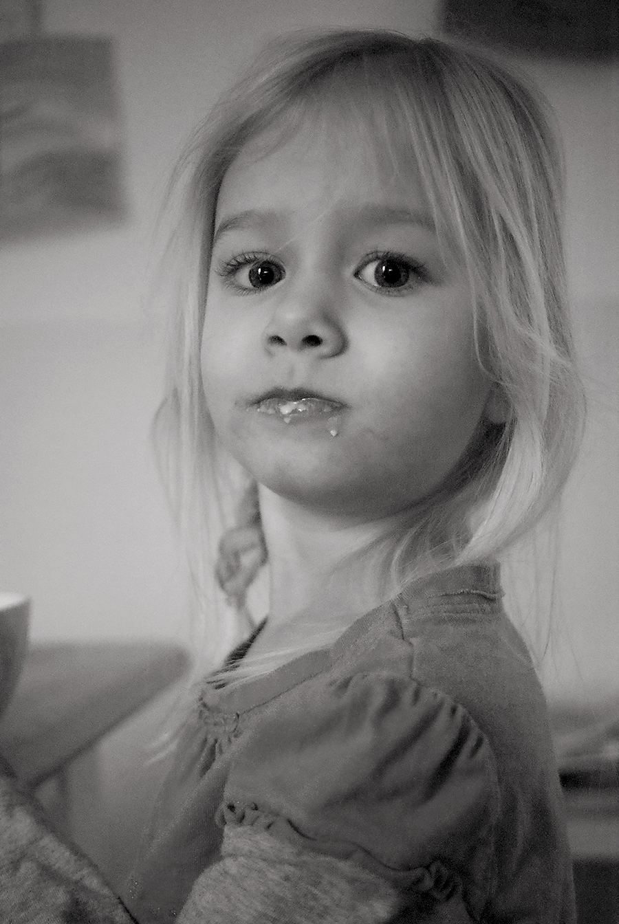
My daughter Aeralind in low natural light coming from a window early in the morning on a rainy day. She hasn’t been receptive to having her photo taken recently so this is a rare treat! ISO 3200
Image 4: A subject outside shortly after the sun has set or if you’re feeling brave loooong after the sun set.

My favorite from this assignment is from Amber who says “I do not know how to use any settings on my camera other than auto and the setting that is currently being covered in the class.” Well, just telling her to change her ISO and point it at the sky and she created this great image! Do you see the airplane! So cool! ISO 3200
Shutter Speed: Definition
Time to jump into this week’s lesson.
Read More»05
2013Hold tight, friends. Compared to January, February is going to be one intense month! We’re going to attempt to hammer down the exposure triangle. We’ll go bit by bit, but for those of you unfamiliar with the exposure triangle this is going to be a month full of learning! The exposure triangle has three parts (duh, it’s a triangle. I’m a master of the obvious): Camera ISO, Shutter Speed, and Aperture. We’ll hit these one week at a time and pull it together in a large assignment at the end of the month. But first let’s recap some highlights from your first assignment!
Assignment Recap
This week I’ll show you an image from each participant because there are only 6 active participants in the group pool. I may showcase fewer photos in subsequent posts, but I’m just overwhelmed with joy that 6 people jumped in!
The soft processing, focus on the toes, and timelessness drew me to this image. Add in the juxtaposition of a girl wearing her Sunday best and eating drippy ice cream and this definitely catches my eyes! CraftLea has captured one for the wall here.
Andrew Aldrich is my father in law. I call him “The English Major” because book learning really isn’t his style. I’m so proud to see how far he’s come in the past few years through mentor-ships and watching all the YouTube material he can get his hands on! This was taken using a DSLR, but Andy also has a SLT in his endless bird photography gear 🙂 I could totally see this as an art print.
Heather Beals caught this great candid of her daughter. I love the expression and that she filled the whole frame with her fierce girl. She also managed to use on-camera flash competently: she’s not too close to the wall (leaving horrid shadows) and she’s not to close to her subject (washing out/overexposing the skin). The quirky camera angle just adds to the photo feeling, but it’s the expression here that really makes the photo!
Sara Beth nailed this. Stunning image, vibrate colors, great focus on the subject. Those flower hairs… dreamy. Sara Beth is using a point and shoot! Proof that fantastic images are made by people (who know their gear) rather than the best camera. Bravo!
Of the folks so far in the group, Teddy Bouch has the most defined style of the current participants: he loves the interplay of contrasted light. In this image the symmetry from the lights on the boat and the water really caught my eye. He also nailed a solid black exposure at night which is not an easy feat and show growing mastery of his camera.
Amanda is the mother of little Micah that I photographed in December. I personally have a love for a more lifestyle/photojouranlistic style with kids so this image absolutely caught my eye. The attitude in Elijah’s face and the complete toddler disregard for the photographers presence along with the perfectly highlighted static electricity hair just screams of everyday childhood to me. The black and white processing brings out all the detail while minimizing visual clutter. Great capture and one I know she’s putting on a canvas for her wall!
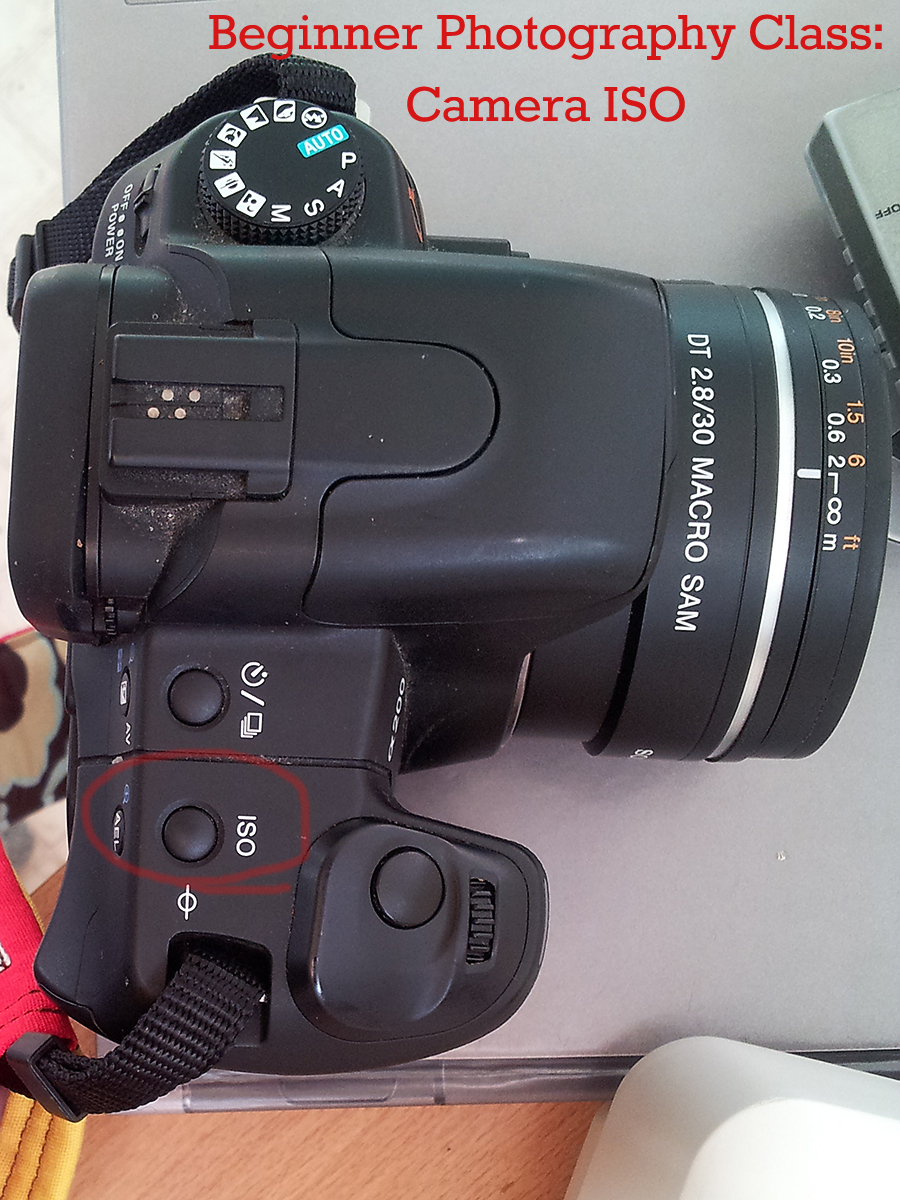
Camera ISO: Definition and Brief History
Ready to learn about camera ISO? Me neither. But let’s eat this elephant one bite at a time!
Read More»29
2013Photography Critique: The Vocabulary
I hope you’re wearing your heavy duty antiperspirant today. I know I am (mainly because I’m afraid no one is going to link-up!). Before we dive into photography critique, I thought I’d throw out a helpful list of vocabulary so you know what on earth I’m talking about when I critique my own images! Most of these things we’ll get into more in depth as the year goes on, but for now I’ll give short no-nonsense definitions so you can start familiarizing yourself with the terms and use them yourself. I’m also not going to give you too many words for right now. We’ll stick to the basics.
Underexposure: An image that is mostly dark. Even what was white looks grey.
Overexposure: An image that is mostly light. Even what should have been black will look gray.
Depth of Field: How much of an image is in focus (a function of aperture). A shallow depth of field has very little in focus while a wide depth of field will have more in focus.
Warm: A white balance that tends toward yellow or orange. You whites will be yellowed.
Cool: A white balance that tends toward blue or green (maybe even purple.) Your whites will be bluish.
Noise/Grain: White or colored speckles particularly in the darker colors of the image. Seen when an image is shot at high ISO.
Sharp: When an image is focused well on what the photographer wants your eyes to land on. In a portrait, this is usually the subject’s eyes.
Leading Lines: When something in the photo moves your eyes toward your subject or around the image. Think family sitting in the middle of a railroad track, the track leads your eyes to the family.
Sun/Lens Flare: When the sun reflects off your lens and into your image. This can be purposefully used or it can be an unfortunate accident.
Personal Photography Critique
You’re going to get both my SOOC and my edited images. Mainly because I want you to see that if you don’t have editing software you can still take great photos. But I also want you to see that even a “professional” photographer messes things up and may have to save them in post processing. Most of these are my own daily photographs, but there’s a couple client photos in here too so you can see my process from initial image to final product.
Alright, here I go!
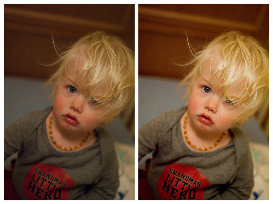
Why I like this photo: This is an emotional image for me. Sedryn had bronchialitis and was such a sad whiny boy! Those flushed red cheeks, crusty nose, and that pouty mouth… sigh… adorable.
The Bad: My exposure is a little darker than I prefer.
White balance is also a tad off. Sedryn’s room has Tungsten lighting (your old filament type bulb) and knowing how grumpy he was going to be waking from nap I did not tweek white balance as much as I could. I need to get better at doing that quickly! The blanket below his elbow with the blue bit, that white should be true white. Even my final edit is a touch on the warm/orange side. I like things warm, but this might be a bit too much.
The high ISO I used to capture this shot sans flash caused a ton of grain in the back ground. You can see it the worst in the dark parts of the crib back. A newer camera or larger sensor might not have this problem… but my current camera is always grainy above 400 ISO and this was shot at 1600.
The Good: In that tiny split second that he actually looked at me, I did nail focus on the visible eye! Woot! Not easy when I was shooting wide open at f/1.7 to make up for the lack of light in the room. It’s also a skill (picking focus points) that is less than a year old for me.
The wide open aperture of f/1.7 blurs out the background leaving you focused on the baby and not the potentially distracting background.
Why I like this Photo: I actually made my husband pull over the car and used the roof of the car as a tripod. We were on our way home from Owl-ing at a friend’s house. Those clouds lit up by that full moon… absolutely breathtaking!
The Bad: Because I was using the roof of the car as a makeshift tripod I had very little control over the composition of this image. That means I had pretty much no choice but to capture that super distracting lens flare and the “for sale” sign in the bottom right corner.
I nowhere near captured the actual scene before my eyes. It’s too bright and the contrast is not deep enough. Some of this is the limitation of a camera and I couldn’t change it. If I had more knowledge of High Dynamic Range Photography (HDR), I might have been able to do a better job bringing this out in the edit. However, HDR isn’t something I’m super interested in learning.
The Good: Obviously I was able to get rid of the lens flare and the for sale sign in the final edit. Hooray! I was also able to increase the darkness of the sky and while keeping the beautifully reflective light on the clouds.
Using a car for a tripod with a shutter speed of 1/30 of a second, I’d say I rocked getting a sharp image. Normally there’d be camera shake with an exposure time that long!
I like the way the power lines move your eye around this image from the moon down to the clouds and back again. It’s a good use of leading lines in the composition, though I’ll admit I didn’t have much choice in the matter due to the position of the parked car!
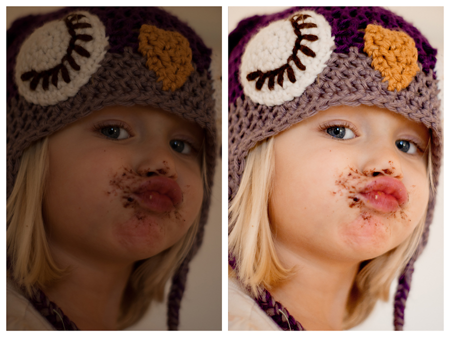
What I like about this photo: There is nothing distracting you from the full glory of her pursed lip birthday cake face! (her dad’s birthday)
The Bad: As you can see, I seriously underexposed the original image. Moments before I had been shooting her backlit brother. I turned around and saw this and captured it with the settings I had. After all, toddlers move so quickly. Had I not been shooting in RAW, I would not have been able to save this image at all! I’ll tell you about RAW later, but if you know what RAW is know that I normally shoot my kids in JPEG. RAW files are just too big! I must have not switched back after a client session.
The back eye is out of focus due to her face angle/my wide open aperture. Not the worst offense in the world… but it drives me crazy!
If I was being a perfectionist, I should have edited out that little string on the hat in the bottom left corner. And maybe also the bit of orange dirt on her left shoulder…
The Good: I filled my frame with my subject leaving nothing distracting to your eye! (which is impressive if you had seen what was on that table in front of her!)
I have learned to save potentially unusable images in Photoshop Elements. It’s always better to get it right in camera, but it’s nice to know how to fix it if I mess up!
The front eye’s eyelashes are perfectly sharp! I forgot how much I love this lens.
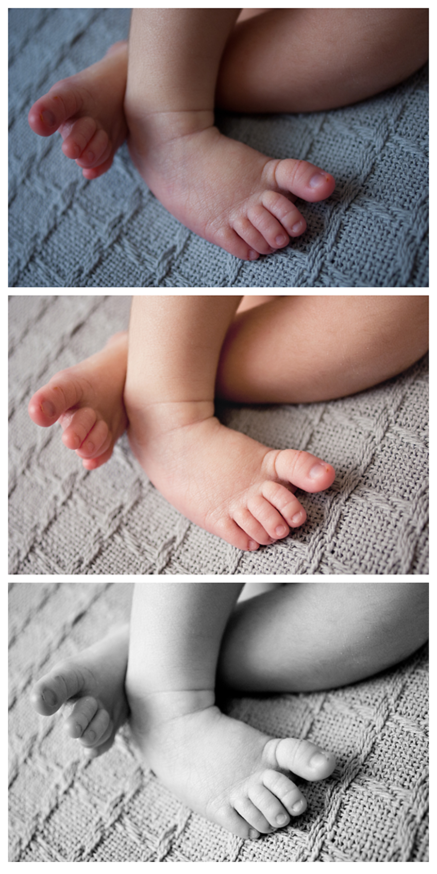
What I like about this photo: As a mom (sleep-deprived in these stages of my children’s lives), I so appreciate the capture of the tiniest details. These are the things that I loved the most but can remember the least. Sedryn’s extra long blond hair. Aeralind’s legs always pulled up nearly to her chest. Bronwyn’s feet always popping out of her blankets. Sigh. I guess I’m more emotional about my imagery than I thought!
The Bad: I think I either missed focus or should have used a wider depth of field. This is my 35mm Macro so I’m less than 2 inches from sweet Ethan’s feet here. I typically choose to manually focus these shots b/c the autofocus is slow this close to the subject. So it could be that I’m off. Yet, I also forgot that the closer you get to your subject the shallower your depth of field gets. If I had shot at a wider f/stop, maybe f/4, then maybe his big toe would be in focus.
The Good: I actually think my white balance and exposure on the original shot wasn’t so bad. His skin really is that red/magenta. The blanket is a little bluer than in real life, but not too bad overall. It’s not very bright, but this is also a RAW image so that’s a given. I always have to brighten my RAW images in post processing.
I like the color edit, but not nearly as much as the black and white. The black and white is so timeless. Hopefully, a beautiful memory for this client!
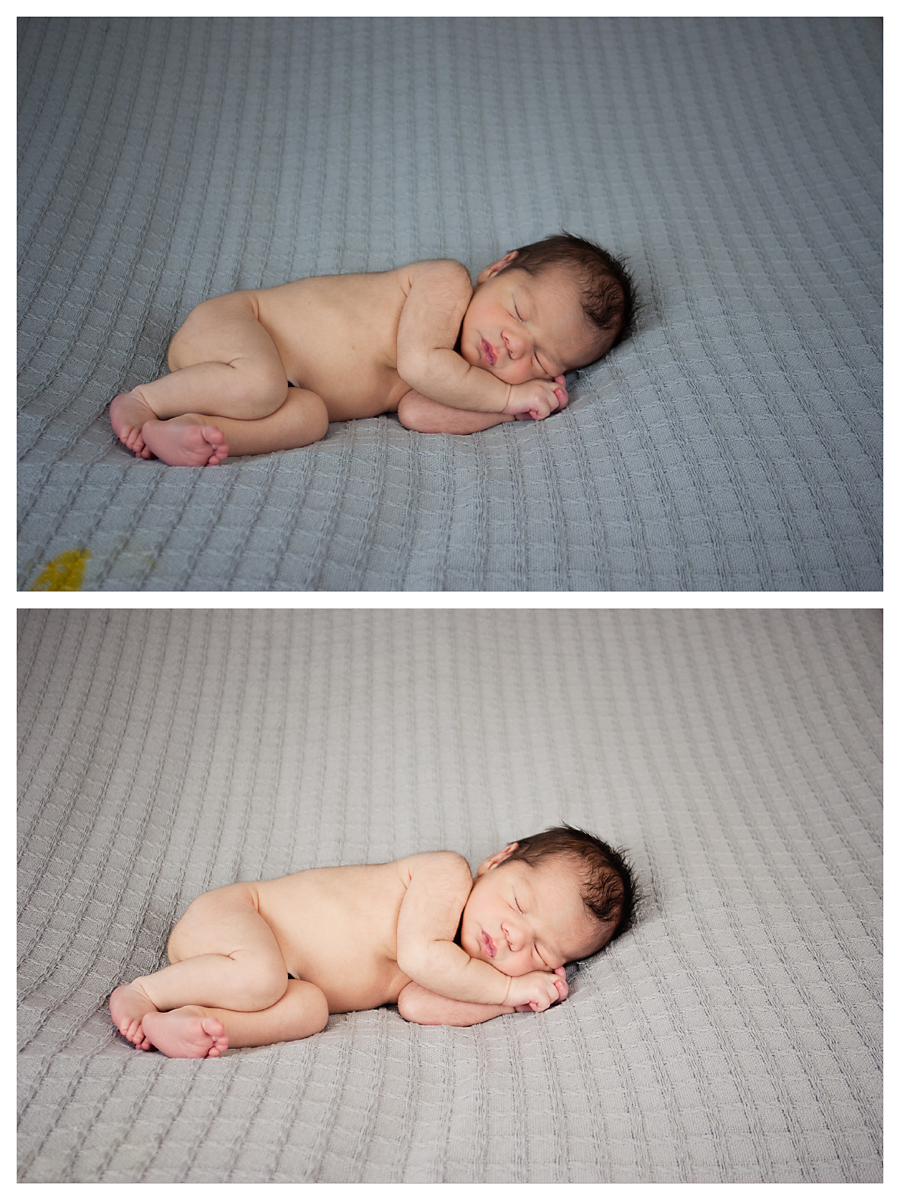
What I like about this photo: Ethan is modest (which was hard and often is hard for newborn boys!). And he just looks so peaceful. I also managed not to catch any of my backdrop stand in the image (sometimes I mess that up a ton).
The Bad: As you can see, the real life of a newborn photographer is exposed in the bottom left. That was only about a third of that accident, the rest caused me to have to change shirts. Ahem. So I had to edit that spot out.
My white balance is a wee bit too blue, but also not too bad. I did brighten and warm it up significantly while editing.
I think the contrast on the final edit might be a bit too much. I think I prefer a softer look in my newborns than what I achieved here.
I wish I could have straightened or intertwined his fingers under his cheek. This is my ‘safe’ shot. I tried to get his fingers straighter for a subsequent image, but Ethan just would not have it! Every baby has something he doesn’t like me to do; for Ethan, messing with his fingers would startle reflex him and curling him up in a ball was clearly uncomfortable for him.
My depth of field is also a little shallow. His foot is out of focus. But Ethan was super tall (nearly 22 inches!) so I think I would have been alright with a more average baby 😉
The Good: This is a really solid client shot. I love how smooth the blanket is in this shot, which is something I also struggle with because most of my blankets are very wrinkly (but soft!) cotton. His face is sharp. He looks sweet. And he’s posed pretty well with his face not buried in the blankets. It’s just a really solid shot.
A Quick Look Ahead
February is likely to be the most intense month of this class. Each week you’ll have a medium sized assignment, followed by a link up the following week. We’re going to learn about the exposure triangle. By the last week, you should be able to begin to shoot in manual mode if your camera has manual mode. If your camera doesn’t have manual mode, you’ll be fully equipped to use A-priority or S-priority(sports mode) and know when to use which. It’s going to be intense, but worth it. The assignments should only take 15-30 minutes a week, but keep trying to practice using your camera 5-10 minutes a day as well.
Your Photography Critique Assignment
Now it’s your turn to shine 🙂
- I want you to put up 3-10 of your best images on a blog post and write your personal critique below each image; Link your blog in the comments! If you don’t have a blog, I’ve created a Flikr group for our class. You’ll simply create an account, upload your photos, and put your critique into the description of each image, and then add those images to the group pool. Flikr is pretty intuitive, but if you need help feel free to use my contact me page and I’ll help as much as I can. Alternatively, you could use free blogging sites like Blogger or WordPress.com and create a blog just for this class. It’s really up to you!
- Once you’ve completed your personal critique, come back here and link up your work if it’s a blog. Link your specific post rather than your blog as a whole. For example, http://www.quietgraces.com/free-beginner-photography-class is a good link to a specific post while http://www.quietgraces.com would only link to my home page and make it hard for a user to find my work. You will also be able to link to a specific photo on Flikr or a Flikr set.
- Go check out the work of the person who commented right before you (or any image that catches your eye in the photo pool!). Pick one of their images and give them specific “Oreo” photography critique in the comments section. Don’t skip this step! It will only take a few minutes to critique one person. Additionally, this is what will build our class community and will also give you opportunity to both practice giving critique and receiving it. Each time I host a homework link-up, you will be instructed to do this step.
I can’t wait to see your work! Tell me in the comments, what did you think of this assignment? Was it helpful? What did you learn about yourself as a photographer?
24
2013Starting around the time that I was in the process of writing my Life Statement, I’ve had a string of sessions that are right in the middle of living their beautiful-mess with grace. First, there was Karen with her heartbreaking story of trusting wholly in the grace of God. And then there was this session with fellow photographer Amanda of MyOhmanda Artistry and Photography. But then again, maybe God has just opened my eyes to the messy beautiful more because of that Life Statement. In any case, let me share a little of Amanda’s life with you.
Amanda’s had a rough year. Her mother, who diligently prayed Amanda through some rough situations in her life, went home to be with the Savior this year. Her hopes for a VBAC were crushed. And she has two boys 4 and under and was expecting a third. Children that young just make life joyfully ridiculously full of unexpected mess.
Micah came on the very special date of 12/12/12 as a little reminder of how many unexpected ways God blesses us through pain and through joy. I don’t know the end of this story, but I do know that like all parts of His story it’s going to point to the gospel: the story that our perfect doesn’t have to be perfect because He loves us enough to die for us despite our failings. I’m excited to have been introduced to the joy of walking with her through this season.
My personal favorite part of Micah’s Session is the Greenville, SC mother and baby newborn photography images we took. Amanda was so willing to get in the picture with her family. It’s not easy as woman to see yourself in images and try not to listen to that evil voice that says we should look a certain way. It’s even harder to get in the photograph right after you’ve had a c-section and it’s physically painful to do so. But Amanda wanted to be in the picture. Having just lost her mom, she knows how valuable ever single image of her mother is. Her boys will always treasure these images.
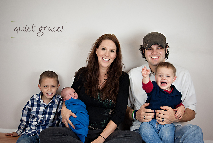
Even this family image is precious. It’s real life lived gracefully with a 4 and 1 year old plus a newborn. The joy, the laughter, the tantrums, the tears, and the sheer absurdity of each day all rolled up in one image. (Does Newborn Micah really have his eyebrow raised as if to say, “Who are these people?!”)
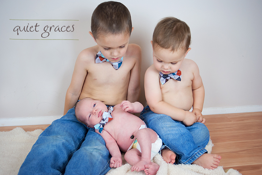
Don’t worry, we did get one great image of all three boys together. A miracle image if I do say so myself!
Here’s just a sneak peak of all of the rest of the adorableness in this session.
Amanda, it was a real honor to be invited into your life during this hard season. Thank you for choosing me to capture your Greenville, SC Mother and Baby Newborn Photography.
