30
2013We’ve played around with the rule of thirds, leading lines, different angles, and shooting details, now lets bring it all together into a diptych and a triptych.
What is a Diptych and Triptych
A diptych is a pair of images and a triptych is a trio of images placed together to tell a story or make a comparison.
That’s a deceptively simple definition for a fun technique that when used properly can make twice (or three times) the storytelling impact of a single image. Choosing the two or three photographs to send the message you want the viewer to see is heart of creating diptychs and triptychs. The images can be of the same scene processed differently or at different moments in time (like a series of a diver entering the water or a child playing with a toy). Or the images can be of completely different scenes that combine to tell a story or communicate a message.
Examples and Analysis of Diptych and Triptych
I have fond memories of creating Diptych and Triptych for my photography 2 class in college. I tried to dig those out and had my husband scan the one I could find as well as created a few more.
I’m going to critique each set of images here by asking the following questions. This is also a good model for critiquing the resulting diptych/triptych in our Flickr Group.
- Are the images making a comparison, telling a story, or making a statement, or something else entirely?
- Verbalize the comparison/story/or statement this set of images makes.
- What could make this set of images stronger?
- What is really effective about this set of images?
Mountaintop Experiences
- Are the images making a comparison, telling a story, or making a statement, or something else entirely? I think this one from my film days (it’s not the greatest scan… but it’ll do) is just setting a scene.
- Verbalize the comparison/story/or statement this set of images makes. I think if I just saw the middle picture or even the two pictures on the right, you’d think she was just reading a book and eating a bag of chips with a pretty view. It’s the third photo with the rope and the pack that really sets the scene of a break from climbing.
- What could make this set of images stronger? I wish I’d had a wider angle lens to take this shot. But I’m pretty sure that there was no more than 10ft across the top of that precipice. It also would have been nicer had they lined up more directly, but again.. not a lot of room to maneuver (and there were at least 5 others up there with us). I think I stood in the same place for all three images.
- What is really effective about this set of images? I think it’s just an expanded view of a small event. I like how it just enlarges what your intial thought is looking at the images.
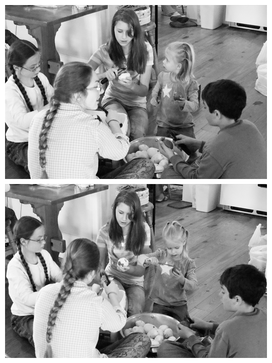
Pealing Potatoes
- Are the images making a comparison, telling a story, or making a statement, or something else entirely?
Making a statement. - Verbalize the comparison/story/or statement this set of images makes. When I took saw these two together, I was struck so much by how important it is for my little girls to have strong role models. The girls are watching everyone and modeling their actions even on the most mundane things. I put these two images together to help me visualize the importance of older girls/women in young girl’s lives.
- What could make this set of images stronger? I shot with a pretty wide depth of field (f/8) I wish I would have opened up a bit more (maybe f/3) to cut down the distraction of the backdrop. I also wish I would have been a bit closer to the subjects.
- What is really effective about this set of images? The confused look toward her role model followed by the determination to peal that potato. It’s her face that makes this strong. I also think the black and white processing helped to focus us on her face.
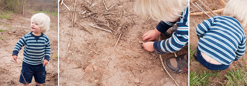
Boyhood
- Are the images making a comparison, telling a story, or making a statement, or something else entirely? I think they’re most effectively telling a story.
- Verbalize the comparison/story/or statement this set of images makes. One word. Boyhood. My girls are pretty tom-boyish, but they’re timid at first. Not Sedryn. Dirt, check. Stick, check. Pants falling off, who cares?
- What could make this set of images stronger? I’m not sure I like the way I have them arranged on this storyboard. I sort of want the two detail shot on the ends and the boy with his self satisfied dirty face in the middle. I also wish I’d taken them a bit later during his play when he was much messier.
- What is really effective about this set of images? It’s emotional for me. This boy setting out to conquer the world and starting out with the nearest patch of dirt. But it’s also so mundane. This is just what little boys do.
I had a good making a statement triptych that I couldn’t find to scan. An image of a pristine waterfall, a backhoe in a cleared field with a beautiful mountain view in the background, and a broken stop sign in a pick of trash. The statement was the need to keep some areas of the world pristine I wish you could see it… but I just wanted to give you an idea of how you can make a specific statement like that with your images in a triptych series.
Diptych and Triptych Assignment
Get out there and create 1 diptych and 1 triptych. Bonus points if you feel inspired to do more than one. In the resources section below, you’ll find some inspiration images as well as tutorials/helps for putting your three images in one frame. If you want to put them all in one frame, go for it. If that seems way too much work for you at this time, then just title all your images something like Diptych 1 and Diptych 2 so we know which goes with which.
When you post your images over in the Flickr Group, leave no description beyond maybe a title, and see what others take from your work in their critique comments. You could put the questions in the description if you wanted. After a few comments, feel free to add your own purpose/self-critique.
Comment on 2-5 (or more) of your fellow classmates Diptych/Triptych and answer the following questions in your critique:
- Are the images making a comparison, telling a story, or making a statement, or something else entirely?
- Verbalize the comparison/story/or statement this set of images makes.
- What could make this set of images stronger?
- What is really effective about this set of images?
Resources
Let me share a few extra resources as you create your diptych or triptych.
Inspirational Diptych or Triptych
Get your creative juices flowing by clicking any of the following links for inspiration.
Diptych Photography: The Art of Combining Two Images
Diptych & Triptych: 5 Prime Examples
Collections of Triptych Photography by Adde Adesokan
Triptych: When a Single Picture Won’t Do
How to Make a Diptych or Triptych in a Single Frame
You can use photo editing software to make a Diptych or Triptych in a Single Frame. Here are a few actions/tutorials for making collages in Photoshop Elements/Photoshop or Lightroom as well as a free software program that you could use to make your diptych and triptych.
Creating a Triptych in Lightroom (same technique would work for a diptych. I don’t have Lightroom… so you’re on your own for this one!)
A free PSE/PS action for a Diptych (One horizontal and one vertical image)
A free PSE/PS action for a Diptych (Two vertical images)
A Set of Free Actions including two Diptych (Two horizontal/two vertical… I use this whole set all the time!)
A free PSE/PS action for a Triptych (3 vertical images)
CollageIt (Free Program for creating collages on Windows or Mac. I have no experience with this… just thought it might be helpful if we didn’t have photo editing software.)
Please let us know in the comments if you know of another way to make simple collages for this assignment! Use links if you can.
I can’t wait to see what stories you tell with these!
23
2013My sociology teacher in high school asked us to draw a flower on a note card on our first day of class. We passed them up anonymously and she held each one in front of the class and talked a little about each person.
I drew an orchid. I’m not great at drawing, but you could tell that I was trying to capture a specific flower.
She labeled me “meticulous.” I had figure out how to spell it and then find a dictionary.
meticulous (adj): marked by extreme or excessive care in the consideration or treatment of details.
She had nailed me.
At that time I was a raging perfectionist who spent hours on school projects or journaling over conversations with friends. Over a decade later I’m a reformed perfectionist who is able to differentiate between superfluous details and those that really matter. I also remembers details about people in a way that consistently surprises them and am writing a 52 week beginner photography class because I can’t contain all the details I’m passionate about into just 6 weeks :-p
Did I mention she nailed me?
Unlike the rule of thirds or leading lines or changing my perspective, capturing detail images comes very naturally to me. I’m thinking that may not be true for all of you.
So let me tell you a little about the whys and my process for capturing detail.
Detail Images are the Vector for Memories
Let’s stop a moment and think back to your wedding day. Or the day you met your girlfriend. Or the day you birthed your baby. Or even that first day on your current job. Or that sad day when you buried a parent or child or friend. Or that lazy summer afternoon that you spent with your sister at 9.
What do you remember most?
When I was 9 and my sister was 8, we had a fort in our shed where the neighbor boy wasn’t allowed. I don’t remember much about that fort besides a pile of barbies. Except for one day when my sister came tearing out of the shed screaming that she had seen a “rat thing.” She described it as a rat with a red mohawk. My sister was never scared of anything so that was the end of our fort. We never played in the shed again.
Do you see what I remember? A pile of barbies. One day. My sister’s description of “rat thing.” All of those things are details. There is not one movie type reel captured in my brain.
When my sister and I talk to my parents about our childhood memories there is nearly no overlap in memories. If we talk about our day at the state fair we all note something different. My dad will ask if we remember how he won us the big-stuffed-whatever-it-was. Mom will ask about if we remember how we had powdered funnel cake sugar all over our hair. My sister will remember how she beat dad on the go-cart track. And I will remember racing down the monster slide with dad and sister on slick flour sacks over and over.
The four of us experienced the same event in time but we all remember it differently. We all have focused in on a different detail.
Memory craves details. It thrives off details. We can’t possibly remember everything about each day because our brains aren’t wired that way. Instead, we put entire days or experiences or traumas into files based off just the smallest detail memories. And each remembered day has a thumbnail image that triggers the rest of the details of that day.
Our memories are wrapped up in the details, even if our future planning is wrapped up in the big picture.
Detail Images both Define and Complete the Story
I could spend a lot of words on explaining why the above statement is true, but as I just spent an equal amount of words convincing you that memory hinges on details, I won’t. I’ll tell my meticulous perfectionist self that a lot of words aren’t what you need to prove that detail images both define and complete the story. Nope, you need a series of images.
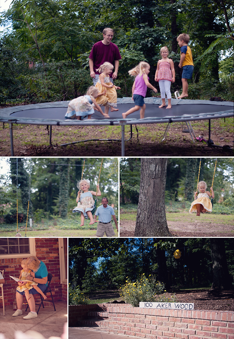
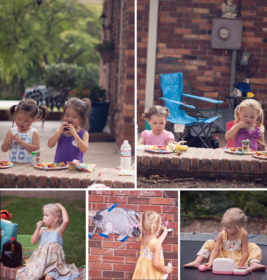
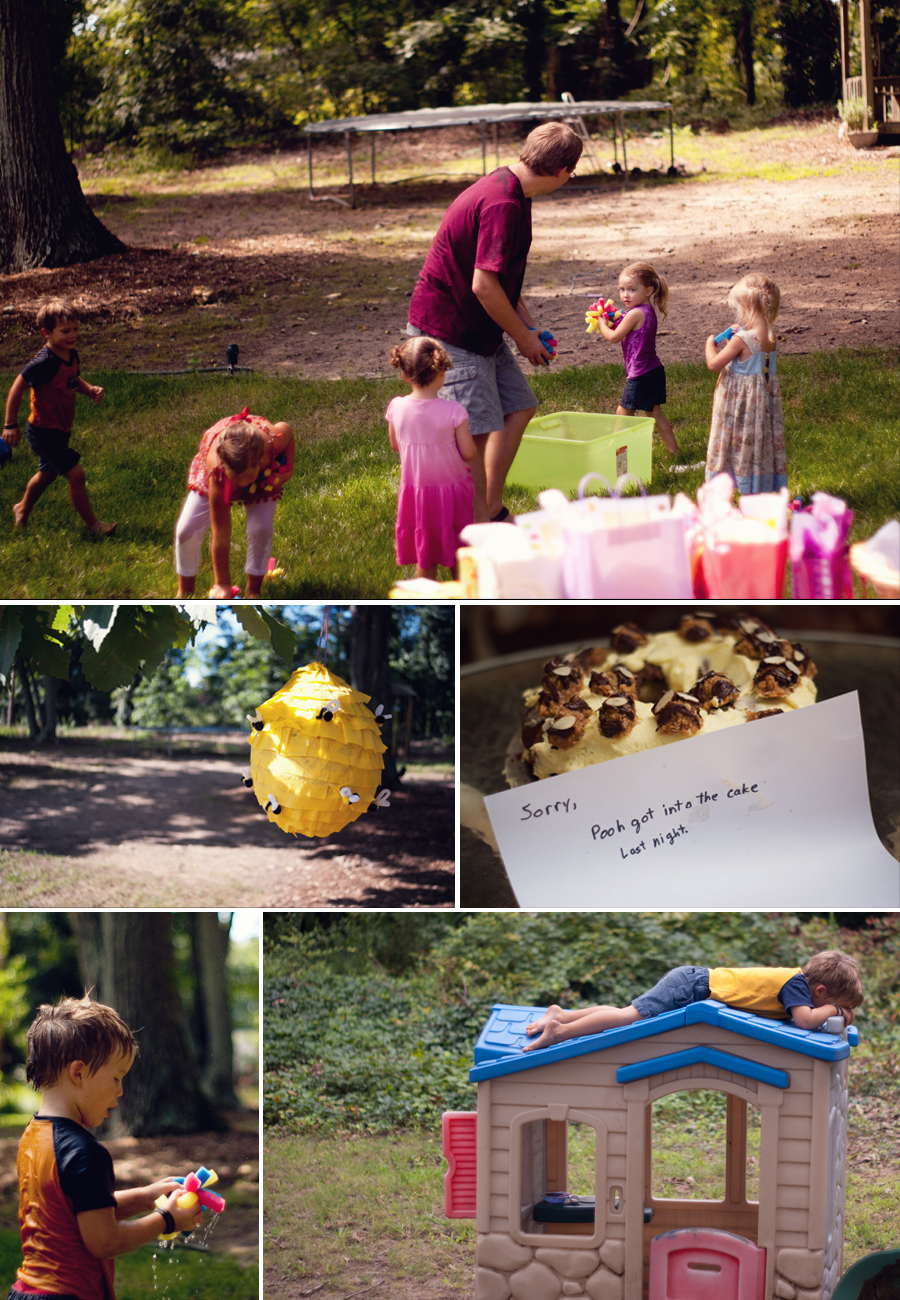
Take a glace at the following series of images that I took at my daughters’ birthday party, then answer the questions following the images in the comments section.
Your first assignment: answer the following questions in the comments section.
- What was the theme of this birthday party? How did you know?
- What activities occurred? Which activities were you cued into by a detail shot? Which activity by a more big picture image?
- Without looking back up at the images, which image was your favorite? Was it a detail or global image? What does that say about you?
Detail Images Assignment
We’re sticking with the deceptively simple assignments throughout this Storytelling with Images Series.
Take your camera out and capture a few (2-4) detail images that tell the whole story in the same way that your memory does. Vague… maybe? But roll with it, because I can’t wait to see how you interpret this assignment over in our Free Beginner’s Photography Class Flickr Group!
16
2013Insanity is doing the same thing over and over again and expecting different results. ~Albert Einstein
There are so many times when I have a camera in my hand that I shoot about 10 frames of the same scene/pose/moment from the same location. Sometimes that’s valid (young kids make goofy faces… people blink… I, too, miss focus), but most of the time it’s insanity. I end up with 5 great photos of the same thing. From a professional standpoint… that’s not very marketable. What client is going to buy 5 photos of everyone looking the same? I’m standing there doing the same thing over and over again… yet expecting different photos!
Moreover, taking the same image over and over doesn’t help me keep storytelling with images. So what can I (or you) do to be better about truly storytelling with images?
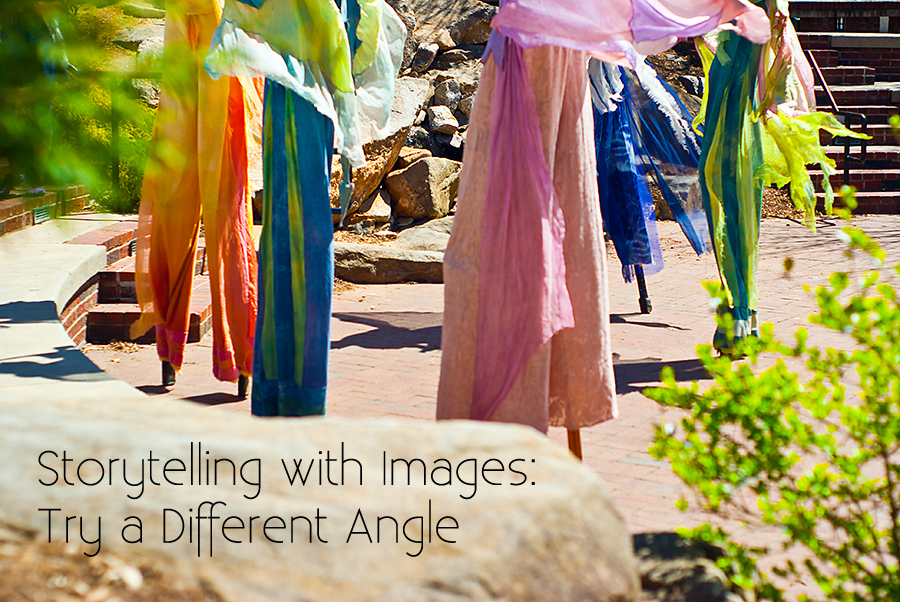
Storytelling with Images by using a Different Angle
About two years ago I participated in a Project 52 challenge. One where an instructor gave us one image or series of images to take on a theme each week. I don’t remember much about this particular challenge as a whole, but I do remember this one assignment to try different angles. “Shoot the same scene from 4 different angles.”
I’d been a hobbyist photographer for a decade at that point and not one of my art teachers had ever given me an assignment like that. This one assignment more than likely is what set a fire inside me for lifestyle photography, to capture the mundane and messy in all these details to tell the real story of a life. In fact, because of this assignment I went to being a prime/fixed focal length lens girl solely (rather than a zoom lens girl) because I have to physically move to create the composition that I want.
Your Assignment
So I’m not going to waste a lot of words on this post. I could tell you how changing your shooting angle will get you on the same level as a child. Or that you’ll pull some beautiful catch lights into a subjects eyes if you have them look up at you with an overcast sky above. Or that your favorite shot will likely be the second or third angle. But I’ll refrain, because I want you to discover your own perspective change. So let’s get down to business, shall we?
Take a series of 3-5 images all of one scene and before each shutter click, physically move your body (don’t just zoom your lens) to a different position than the one you were in a moment ago. Bonus points if you do more than one scene!
That’s it. When you’re done post the series over in our Flickr Group for some friendly critique. Then come back here and let me know how this deceptively simple assignment changed your perspective on Storytelling with Images.
09
2013Last week we talked about how the Rule of Thirds creates a stronger composition through putting the main subject in one of the area’s a viewers eyes naturally land. This week we’ll introduce another key composition concept.
Leading Lines
Leading lines are any lines, straight or curved, the help move a viewer’s eye throughout the frame. Successful leading lines help to create a visual narrative causing the viewer to move from one important aspect of the image to another.
When I think of leading lines, the first example that comes to my mind train tracks photographed so that the viewer’s eye is led right off the horizon. It’s a classic effect that always gives the viewer a sense of journeying forward.
However, most uses of leading lines are more subtle. A horizon line or the curve of the oceans shoreline can be a leading line. A watermelon rind can be a leading line that points us to the smile of a still dripping face. A subject’s extended arm or leg may bring the viewer to examine more carefully. An insinuated line like the probable flight of a softball into the waiting outfielders mint could even qualify as a leading line.
How to Use a Leading Line
Let’s be honest, sometimes great leading lines in your image are a sheer accident.
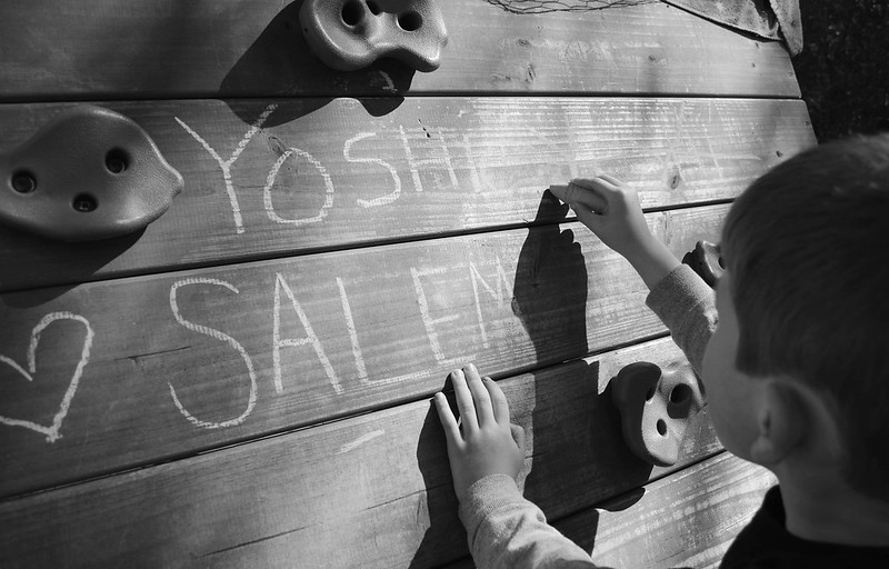
The horizontal lines of the writing surface draw the viewer straight to the subject writing. Jessica probably didn’t notice this effect when she snapped this photograph (kudos if she did!), but those lines contribute to the narrative of her son’s written words.
However, our assignment will be to notice and intentionally use leading lines, so lets jump into a few case studies of both obvious and more subtle leading lines.
Leading Lines Case Study
All of the following images were provided by SarahBeth and TeddyBouch. As I’ve mentioned before, these two class members have been gracious enough to fill in the photographic gaps created by my primary role of wife and mother. I’m so grateful for both of them!
When we’re critiquing photographs solely on the basis of leading lines, we’ll use the following questions:
- What is creating the leading line (or lines)?
- Where is the viewer’s eye led?
- What is the story this image is telling you as a viewer?
- Do the leading lines create a narrative that helps the viewer understand the story the image is trying to tell?
I’m going to answer each of these in the analysis of the following images.
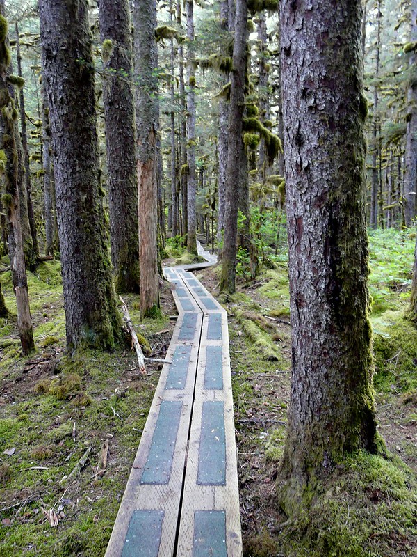
- What is creating the leading line (or lines)? There are two sets of lines in this photo: the raised wooden path and the tall straight trees.
- Where is the viewer’s eye led? My eye is immediately led up the path, but once i reach the visual “end” of the path my eye catches the upward then downward movement of the tree trunks. At the end of this visual trip, my eye takes another trip up the path…
- What is the story this image is telling you as a viewer? I feel like I’m being quietly beckoned into an enchanted forest.
- Do the leading lines create a narrative that helps the viewer understand the story the image is trying to tell? The leading line of the path is what beckons me into the enchanted forest and is in fact the whole narrative as I understand it. The vertical lines of the trees effectively set the scene.
- What is creating the leading line (or lines)? The shoreline in the foreground, the horizon in the background, and the rim of the island.
- Where is the viewer’s eye led? Up the shoreline curving to the rocks, on to the horizon then back to the island, and finally to the lighthouse.
- What is the story this image is telling you as a viewer? The story I hear is of the importance of this lonely lighthouse.
- Do the leading lines create a narrative that helps the viewer understand the story the image is trying to tell? The leading lines here, although much more subtle than the prior image help the eye focus on the lighthouse.
- What is creating the leading line (or lines)? The shoreline, the horizon, and the clouds.
- Where is the viewer’s eye led? The shoreline leads us to the water. The clouds and the horizon lead us to the mountains and the horizontal clouds.
- What is the story this image is telling you as a viewer? I just see the majesty of creation.
- Do the leading lines create a narrative that helps the viewer understand the story the image is trying to tell? The leading line in front shoreline sort of draws me right past the mountain in the foreground. I’m not sure that it’s a bad thing, but it doesn’t immediately point to the same area as the other leading lines. The clouds here are by far the most surprising lines and I do believe they point us right to the mountains off shore.
- What is creating the leading line (or lines)? The shoreline, of course, but the driftwood/fallen logs are a leading line as well.
- Where is the viewer’s eye led? Up the driftwood, along the shoreline, and back again.
- What is the story this image is telling you as a viewer? A sense of bewildered wonder at so many huge logs: What happened?
- Do the leading lines create a narrative that helps the viewer understand the story the image is trying to tell? The leading lines of the driftwood ARE the story. What happened?
Leading Lines Assignment
Now that we’ve looked at a few images with successful leading lines, lets go out and make a few of our own (1 or more). Pay attention to your surroundings when taking these images. Not only can a set of leading lines upgrade at image from snap shot to something special, but paying attention helps you make sure you’re telling the story you want to tell.
Once you’ve taken a few leading lines images, hop on over to our Free Beginner Photography Class Group and share with us and leave your answers to the following questions on a few leading lines images that catch your eyes.
- What is creating the leading line (or lines)?
- Where is the viewer’s eye led?
- What is the story this image is telling you as a viewer?
- Do the leading lines create a narrative that helps the viewer understand the story the image is trying to tell?
How are you feeling about Storytelling with Images? Did the last two “rule” based lessons help you focus on telling the story well-composed? The next couple weeks we’ll be discussing different ways to compose your images to tell your story better. And I might sneak in an extra post after that before jumping into a the culmination of this series.
02
2013Typically Rule of Thirds is one of the first composition rules that a new photographer learns. Let me be honest. This may be my shortest lesson in this whole series!
Rule of Thirds Defined
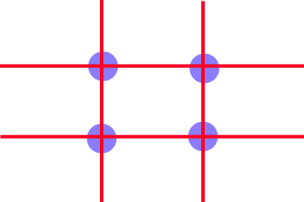
To use the rule of thirds we must mentally divide the image, both horizontally and vertically, into thirds.
The points where the lines intersect are where a viewers eye will naturally land when first viewing an image; therefore, the most powerful place to put our subject is at one of these intersections.
Additionally, aligning an important aspect of our image alone one of these four lines creates a stronger composition. For example, if shooting a landscape scene with a clear horizon line, you’d want to place the horizon on one of the horizontal lines dividing the image into thirds for the strongest composition. Or placing a standing figure along that line if doing a portrait.
And that’s the whole rule. Some photographers do this naturally without even knowing the rule of thirds and the rest of us spend a lifetime honing this skill.
Rule of Thirds Image Study
Lets take a look at some of my recent work and analyze it with the Rule of Thirds.
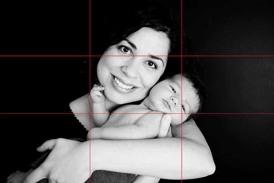
While this is a really beautiful image that I’m sure my client will love, it definitely has some flaws. I cut off her fingers and the baby’s toes in my (in-camera) crop. It’s also a little lacking on the rule of thirds. An important part of the image does fall in one of the intersection points: baby’s eyes. But mom is directly in the center. Her eyes do fall on the top third line… but still this image’s composition is seriously lacking compared to the following image.
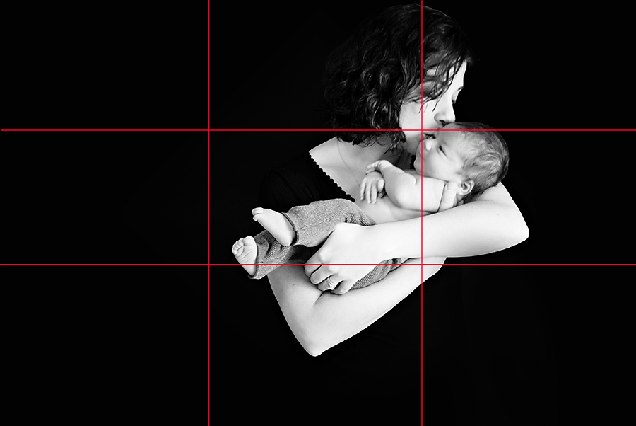
This composition makes me really proud. Mom and baby are lined up along a third line and the kiss/both faces fall at the top right intersection. And the little dude’s smug smile… priceless.
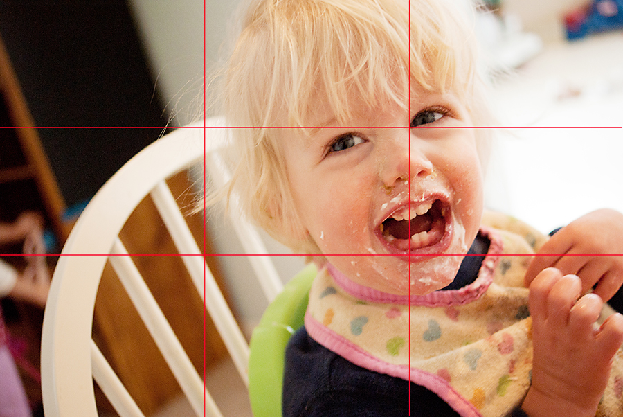
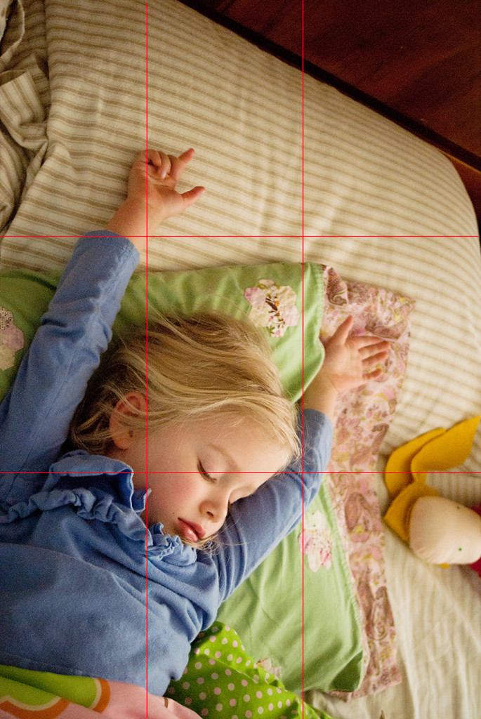
Sedryn’s eyes line up with the top line of thirds and his right eye falls right in the top-right intersection. His body is lined up with a vertical line and his fierce snaggle tooth grin falls at the bottom-right intersection.
While not as strong as Sedryn’s image, this image of Aeralind also follows the rule of thirds. Her body aligns with the left vertical line and her eyes with the top-horizontal line. I missed putting an eye at the intersection of these lines, but all and all, not too bad.
Rules are Meant to Be Broken
Do I follow the rule of thirds all the time? Nope. So I don’t expect you to either! Here are two images where I intentionally broke the rule of thirds and my reasons why.
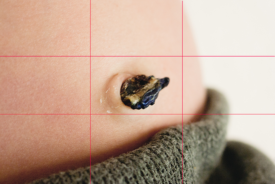
I put this little boy’s belly button right in the middle of the frame. I chose this placement because this type of image usually ends up in a square collage with other little details in either an album or a single print. I needed to know I would be able to get a great square crop from this image so I chose a middle alignment.
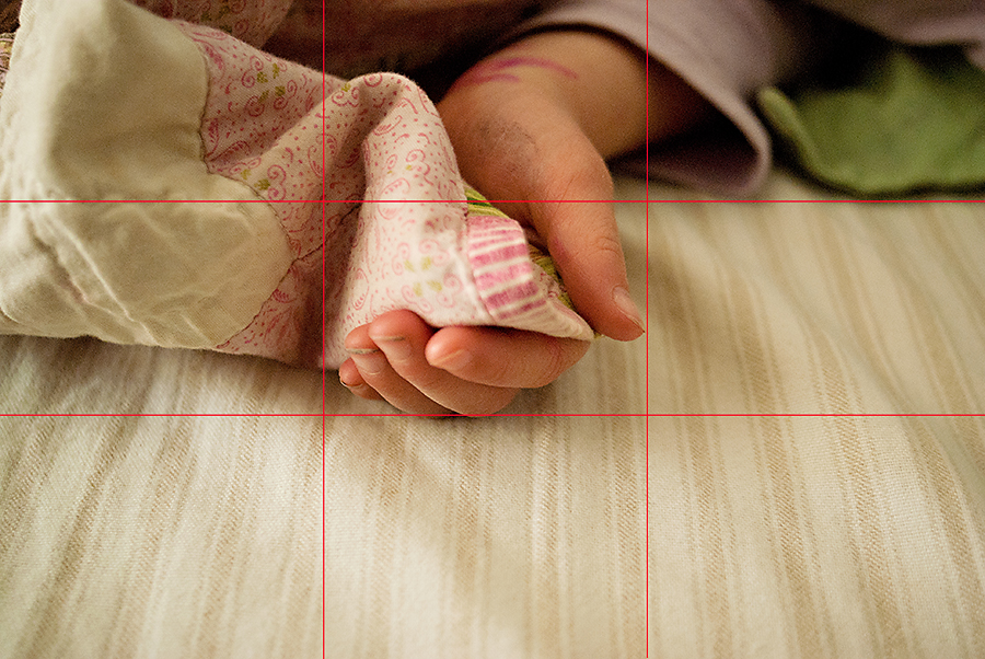
If I’m honest… I was not even thinking about the rule of thirds in this image. I just wanted to grab this blanket corner rubbing memory before my waking child stopped doing it! However, I do love that all of the important aspects of this image occur above the bottom-horizontal line. I also love that her little fingers are in the middle and that the lines on the sheet do a great job of drawing your eye up to her hand.
Rule of Thirds Assignment
The part of the storytelling with images assignment that corresponds to this lesson is to:
- Take 1-3 images following the rule of thirds.
- Take 1 image intentionally breaking the rule of thirds.
Post these images in our Flickr Group for some friendly critique. I look forward to seeing you apply this concept.
As I promised, this is most definitely my shortest lesson yet! Have you used the rule of thirds in your photography before? If so, let me know in the post comments. 🙂

